What is Featureplot R?
In bioinformatics, visualizing data effectively is crucial for interpreting complex datasets. One popular tool used for this purpose is Featureplot R. This tool is part of the Seurat package, designed for single-cell RNA sequencing data analysis. Featureplot R helps researchers visualize gene expression patterns across different cells.
The Seurat package is a comprehensive tool for single-cell RNA sequencing data analysis, offering powerful features such as Seurat Subset for selective data examination. With functions like Dimplot Seurat and Dotplot Seurat, researchers can create detailed visualizations of cellular data. In the debate of Scanpy vs Seurat, Seurat stands out for its user-friendly interface and extensive visualization options.
Importance of Data Visualization in Bioinformatics
Bioinformatics involves analyzing large volumes of biological data. This can include DNA sequences, protein interactions, or gene expression levels. Visualizing these data points is key to understanding and discovering patterns and insights. Featureplot R simplifies this task by providing clear and intuitive visualizations.
Installing Seurat and Using Featureplot R
Installing Seurat
To use Featureplot R, you first need to install the Seurat package. You can do this in R by running:
install.packages("Seurat") library(Seurat)
Using Featureplot R
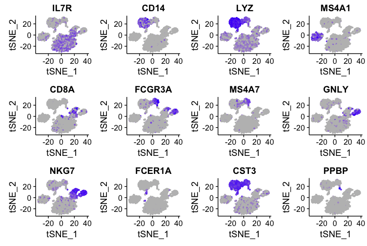
Once Seurat is installed, you can start using Featureplot R. This function generates scatter plots that show gene expression levels in a two-dimensional space. The cells are usually colored based on the expression levels of the gene of interest.
Here’s a basic example of how to use Featureplot R:
# Load Seurat package
library(Seurat)
# Create a Seurat object (assuming 'data' is your expression matrix)
seurat_obj <- CreateSeuratObject(counts = data)
# Normalize the data
seurat_obj <- NormalizeData(seurat_obj)
# Find variable features
seurat_obj <- FindVariableFeatures(seurat_obj)
# Scale the data
seurat_obj <- ScaleData(seurat_obj)
# Run PCA
seurat_obj <- RunPCA(seurat_obj)
# Run UMAP for dimensional reduction
seurat_obj <- RunUMAP(seurat_obj, dims = 1:10)
# Use Featureplot R to visualize gene expression
FeaturePlot(seurat_obj, features = c("Gene1", "Gene2"))
In this script, we first create a Seurat object with our data, normalize it, and then run dimensionality reduction techniques like PCA and UMAP. Finally, we use Featureplot R to visualize the expression of specific genes, such as “Gene1” and “Gene2”.

Key Features of Featureplot R
Flexibility
Featureplot R is highly flexible. You can customize various aspects of your plots, including the color scheme, point size, and even the dimensions of the plot. This flexibility allows researchers to tailor their visualizations to best represent their data.
Multiple Genes Visualization
Featureplot R can display multiple genes at once. This is particularly useful when you want to compare the expression patterns of different genes side by side. By visualizing multiple genes, you can uncover relationships and co-expression patterns that might not be obvious from numerical data alone.
Integration with Seurat Workflow
Featureplot R integrates seamlessly with the Seurat workflow. This means you can use it at different stages of your analysis, from initial exploration to final presentation. Its integration ensures that you can consistently apply visualization techniques throughout your project.
Practical Applications of Featureplot R
Identifying Cell Types
One common use of Featureplot R is identifying cell types in single-cell RNA sequencing data. By visualizing the expression of marker genes, researchers can distinguish between different cell types. For example, if you know that “GeneA” is a marker for neurons and “GeneB” is a marker for glial cells, you can use Featureplot R to see where these genes are expressed and identify the corresponding cell types.
Understanding Gene Co-Expression
Featureplot R is also useful for studying gene co-expression. By plotting the expression of two or more genes, you can see if they are co-expressed in the same cells. This can provide insights into gene regulatory networks and cellular functions.
Exploring Dimensionality Reduction Results
After performing dimensionality reduction techniques like PCA or UMAP, Featureplot R can help you explore and interpret the results. By overlaying gene expression data onto the reduced dimensions, you can see how different genes contribute to the observed clustering of cells.
Advanced Features of Featureplot R
Custom Color Palettes
One of the advanced features of Featureplot R is the ability to use custom color palettes. This can be particularly useful when you want to highlight specific expression levels or make your plots more visually appealing.
Here’s an example of how to use a custom color palette:
# Custom color palette
FeaturePlot(seurat_obj, features = "Gene1", cols = c("blue", "white", "red"))
In this example, cells with low expression of “Gene1” are colored blue, those with medium expression are white, and those with high expression are red.
Adjusting Point Size and Transparency
You can also adjust the point size and transparency in Featureplot R to make your plots clearer, especially when dealing with large datasets.
# Adjust point size and transparency
FeaturePlot(seurat_obj, features = "Gene1", pt.size = 1, alpha = 0.6)
This code increases the point size to 1 and sets the transparency to 0.6, making it easier to see individual points in a dense plot.
Adding Titles and Labels
Adding informative titles and labels can make your plots more understandable. Featureplot R allows you to add custom titles and axis labels.
# Add custom title and labels
FeaturePlot(seurat_obj, features = "Gene1") + ggtitle("Gene1 Expression") + xlab("UMAP1") + ylab("UMAP2")
This example adds a custom title and labels to the axes, providing more context for the viewer.
Troubleshooting Common Issues
Sparse Data
One common issue with single-cell RNA sequencing data is sparsity. Many genes may have low or zero expression in a large number of cells. This can make visualizations less informative. To address this, you can filter out genes with low expression or adjust the color scaling to highlight non-zero values.
Overplotting
Overplotting occurs when too many points are plotted in the same area, making it difficult to see individual points. Adjusting the point size and transparency, as mentioned earlier, can help mitigate this issue.
Computational Resources
Creating high-quality plots with large datasets can be computationally intensive. Ensure that your computer has enough memory and processing power, or consider using a subset of your data for initial visualizations.
Case Studies Using Featureplot R
Case Study 1: Identifying Rare Cell Types
In a study of mouse brain cells, researchers used Featureplot R to identify rare cell types. By visualizing the expression of specific marker genes, they could pinpoint small populations of previously unknown cell types. This discovery was significant for understanding brain function and development.
Case Study 2: Investigating Immune Responses
Another study used Featureplot R to investigate immune responses in human blood samples. By visualizing the expression of immune-related genes, researchers could identify different immune cell types and their activation states. This helped in understanding how the immune system responds to infections and diseases.
Case Study 3: Exploring Cancer Heterogeneity
In cancer research, understanding tumor heterogeneity is crucial. Featureplot R was used to explore gene expression patterns in tumor cells from a breast cancer patient. The visualization revealed distinct subpopulations of tumor cells, each with different gene expression profiles. This information was valuable for developing targeted therapies.
Best Practices for Using Featureplot R
Start with Quality Data
Ensure your data is of high quality before using Featureplot R. This includes proper normalization and filtering to remove noise. High-quality data will result in more accurate and informative visualizations.
Customize Your Plots
Take advantage of the customization options in Featureplot R. Adjust colors, point sizes, and transparency to best represent your data. Customizing your plots can make them more appealing and easier to interpret.
Validate Your Findings
Always validate your visual findings with statistical analyses. Featureplot R is a powerful visualization tool, but it should be used in conjunction with rigorous data analysis to draw reliable conclusions.
Share Your Visualizations
Share your visualizations with colleagues and collaborators. Featureplot R plots can be exported and included in presentations, reports, and publications. Clear visualizations can enhance communication and understanding of your findings.
Conclusion
Featureplot R is an essential tool in the bioinformatics toolkit, especially for single-cell RNA sequencing data analysis. It provides a flexible, powerful way to visualize gene expression patterns, helping researchers uncover insights into cellular functions and interactions. By mastering Featureplot R, bioinformaticians can enhance their data analysis and interpretation, leading to new discoveries and advancements in biological research.
Whether you are identifying cell types, exploring gene co-expression, or investigating disease mechanisms, Featureplot R can help you visualize and understand your data. With its integration into the Seurat package and a range of customization options, Featureplot R is well-suited to meet the diverse needs of bioinformatics researchers.


