Single-cell RNA sequencing (scRNA-seq) has revolutionized our understanding of cellular biology. Tools like Scanpy, a comprehensive library for single-cell analysis in Python, are crucial for interpreting this data. In this tutorial, we will explore three essential visualization techniques: Scanpy UMAP, Scanpy Dotplot, and Scanpy Heatmap. These tools help us understand complex datasets by revealing patterns and relationships in gene expression.
Scanpy UMAP Tutorial:
What Does a Scanpy UMAP Show?
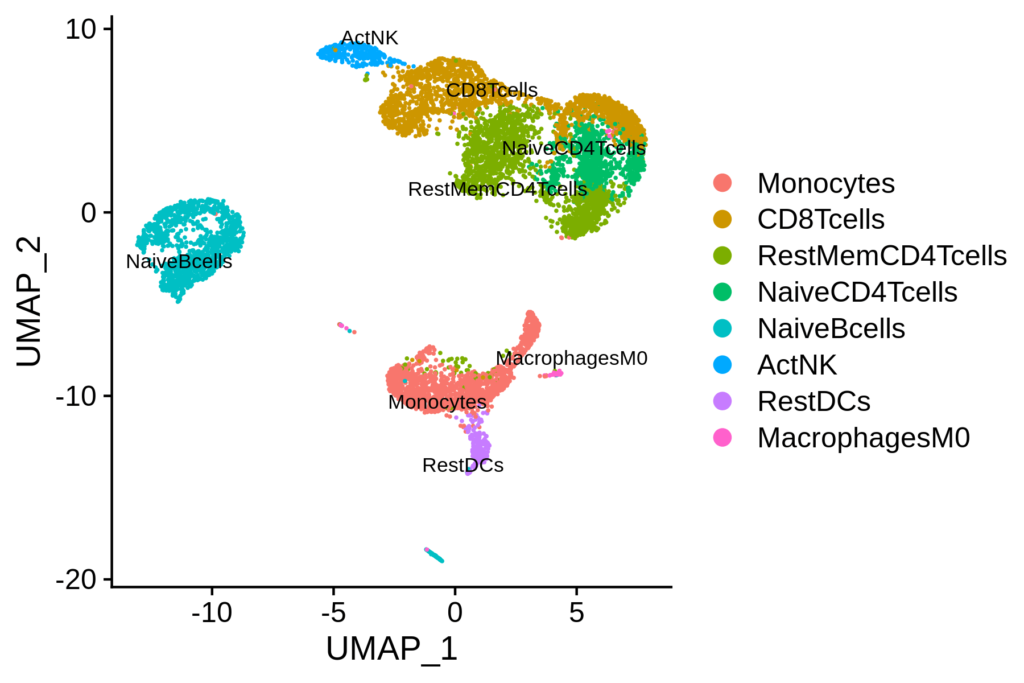
Scanpy UMAP (Uniform Manifold Approximation and Projection) is a dimensionality reduction technique often used to visualize high-dimensional data in 2D or 3D. When applied to single-cell RNA sequencing (scRNA-seq) data, UMAP helps in understanding the relationships between different cells. Let’s dive into how to read and interpret a UMAP plot using an example visualization.
What are Key Features of a Scanpy UMAP Plot?
Clusters
- Clusters: Points that are close to each other on the Scanpy UMAP plot typically represent cells with similar gene expression profiles. Each cluster can correspond to a distinct cell type or state.
- Separation: The distance between clusters indicates how different the groups are. Larger distances suggest more distinct differences in gene expression.
Color Coding
- Cell Type or Condition: Points (cells) are often colored based on their cell type, condition, or other metadata. This helps in identifying which clusters correspond to which biological conditions.
- Gene Expression: Sometimes, Scanpy UMAP plots are colored by the expression level of a specific gene, showing how strongly that gene is expressed across different cells.
Axes
- Axes: The axes in a Scanpy UMAP plot don’t have intrinsic biological meaning. They represent abstract dimensions created by the Scanpy UMAP algorithm to capture the structure of the data.
What are the Functions of a UMAP?
- Dimensionality Reduction: UMAP simplifies complex data, preserving the structure and relationships between data points.
- Visualization: UMAP projects high-dimensional data into 2D or 3D space, making it easier to see patterns and clusters.
- Clustering: UMAP helps identify distinct groups within the data, such as different cell types or states.
How to Make a UMAP in Scanpy? Step by Step Guide:
Let’s go through the steps to create a UMAP plot using Scanpy.
1.Install Necessary Libraries
Ensure you have Scanpy and other required libraries installed:
pip install scanpy matplotlib seaborn
2. Import Libraries
import scanpy as sc
import matplotlib.pyplot as plt
3. Load Data
We’ll use the PBMC3k dataset provided by Scanpy:
adata = sc.datasets.pbmc3k()
4. Preprocess Data
sc.pp.filter_cells(adata, min_genes=200)
sc.pp.filter_genes(adata, min_cells=3)
sc.pp.normalize_total(adata, target_sum=1e4)
sc.pp.log1p(adata)
sc.pp.highly_variable_genes(adata, min_mean=0.0125, max_mean=3, min_disp=0.5)
adata = adata[:, adata.var.highly_variable]
sc.pp.scale(adata, max_value=10)
sc.tl.pca(adata, svd_solver='arpack')
sc.pp.neighbors(adata, n_neighbors=10, n_pcs=40)
sc.tl.umap(adata)
5. Visualize UMAP
sc.pl.umap(adata, color='louvain', title="Scanpy UMAP of PBMC3k Dataset")
The resulting Scanpy UMAP plot reveals clusters of cells with similar gene expression profiles, each potentially representing a different cell type.

How to Intepret a UMAP?
- Cluster Identification: Look for tightly grouped clusters of points. Each cluster likely represents a distinct cell type.
- For instance, you might see a cluster of red points grouped together, indicating a specific type of immune cell.
- Another cluster of blue points might represent a different cell type, such as T cells or B cells.
- Relationship Between Clusters: Observe the proximity of clusters. Clusters that are closer together on the plot indicate cell types that are more similar in their gene expression profiles.
- For example, if you see two clusters close together, they might represent subtypes of a broader cell category.
- Gene Expression Visualization: If the UMAP is colored by gene expression, the intensity of the color indicates the expression level of that gene.
- A gradient from light to dark can show how a specific gene is expressed across different cells.
- High expression in certain clusters can indicate that the gene is important for the function or identity of those cells.
Scanpy Dotplot Tutorial:
What is a Dotplot?
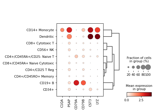
A dotplot is a visualization technique that shows the expression of multiple genes across different groups of cells. In scRNA-seq analysis, Scanpy Dotplot is used to compare gene expression levels across clusters.
What are the Functions of a Dotplot?
- Expression Patterns: Dotplots reveal how genes are expressed across different cell types or conditions.
- Proportional Representation: Dot size indicates the proportion of cells expressing a gene.
- Average Expression: Dot color represents the average expression level of a gene.
How to Make a Dotplot in Scanpy? Step by Step Guide:
Creating a dotplot in Scanpy involves several steps, similar to preparing data for UMAP.
1. Load and Preprocess Data
(Follow the same preprocessing steps as for UMAP.)
2. Identify Marker Genes
sc.tl.rank_genes_groups(adata, 'louvain', method='t-test')
3. Select Genes of Interest
genes_of_interest = ['CST3', 'NKG7', 'PPBP', 'LYZ', 'IL7R']
4. Create Dotplot
sc.pl.dotplot(adata, var_names=genes_of_interest, groupby='louvain', dot_min=0.1, dot_max=1, color_map='viridis')
The Scanpy Dotplot visually compares the expression of selected genes across different cell clusters.

How to Interpret a Dotplot?
- Dot Size: Represents the proportion of cells expressing the gene in each cluster.
- Dot Color: Indicates the average expression level of the gene in each cluster.
- Gene Patterns: Helps compare expression levels of multiple genes across different clusters.
Scanpy Heatmap Tutorial:
What is a Heatmap?
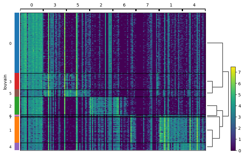
A heatmap is another powerful visualization tool used in scRNA-seq analysis. Scanpy Heatmap displays the expression levels of multiple genes across samples, using colors to represent the data intensity.
What are the Functions of a Heatmap?
- Expression Levels: Heatmaps show how genes are expressed across different samples.
- Pattern Recognition: They help identify patterns and correlations in gene expression.
- Cluster Visualization: Heatmaps can also display clustering results, showing which samples or genes group together.
How to Make a Heatmap in Scanpy? Step by Step Guide:
Let’s create a heatmap to visualize gene expression patterns.
1. Load and Preprocess Data
(Follow the same preprocessing steps as for UMAP and Dotplot.)
2. Identify Marker Genes
(Follow the same steps as for Dotplot.)
3. Select Genes of Interest
genes_of_interest = ['CST3', 'NKG7', 'PPBP', 'LYZ', 'IL7R']
4. Create Heatmap
sc.pl.heatmap(adata, var_names=genes_of_interest, groupby='louvain', cmap='viridis')
The Scanpy Heatmap will display the expression levels of the selected genes across different clusters, using color gradients to indicate expression intensity.

How to Interpret a Heatmap?
- Color Intensity: Shows the expression level of each gene. Darker colors indicate higher expression.
- Rows and Columns: Genes are typically rows, and samples or clusters are columns.
- Clustering: Heatmaps can include hierarchical clustering to show relationships between genes or samples.
What are Practical Applications of UMAP, Dotplot & Heatmap?
Single-Cell RNA Sequencing Analysis
Scanpy UMAP, Scanpy Dotplot, and Scanpy Heatmap are indispensable for analyzing scRNA-seq data. They help researchers identify cell types, understand gene expression patterns, and explore cellular heterogeneity.
Identifying Cell Types
- Scanpy UMAP: Reveals distinct cell populations based on gene expression.
- Scanpy Dotplot: Shows the expression of marker genes across clusters, helping identify cell types.
- Scanpy Heatmap: Visualizes expression patterns of marker genes, aiding in cell type identification.
Exploring Gene Expression
- Scanpy UMAP: Projects high-dimensional data to highlight relationships between cells.
- Scanpy Dotplot: Compares expression levels of multiple genes across different cell types.
- Scanpy Heatmap: Displays expression patterns, helping identify co-expressed genes and regulatory networks.
Investigating Cellular Heterogeneity
- Scanpy UMAP: Visualizes the diversity of cell types within a sample.
- Scanpy Dotplot: Highlights differences in gene expression between clusters.
- Scanpy Heatmap: Shows detailed expression patterns, helping understand the biological variability.
Conclusion
Scanpy UMAP, Scanpy Dotplot, and Scanpy Heatmap are essential tools for single-cell RNA sequencing analysis. They provide powerful ways to visualize and interpret complex datasets, helping researchers uncover the intricacies of cellular biology. By using these tools, we can gain deep insights into gene expression patterns, identify distinct cell types, and explore the heterogeneity of biological samples.
Understanding these visualization techniques and their applications can significantly enhance our ability to analyze and interpret single-cell RNA sequencing data. Whether you’re a beginner or an experienced researcher, mastering Scanpy UMAP, Scanpy Dotplot, and Scanpy Heatmap will undoubtedly improve your single-cell analysis workflow.


